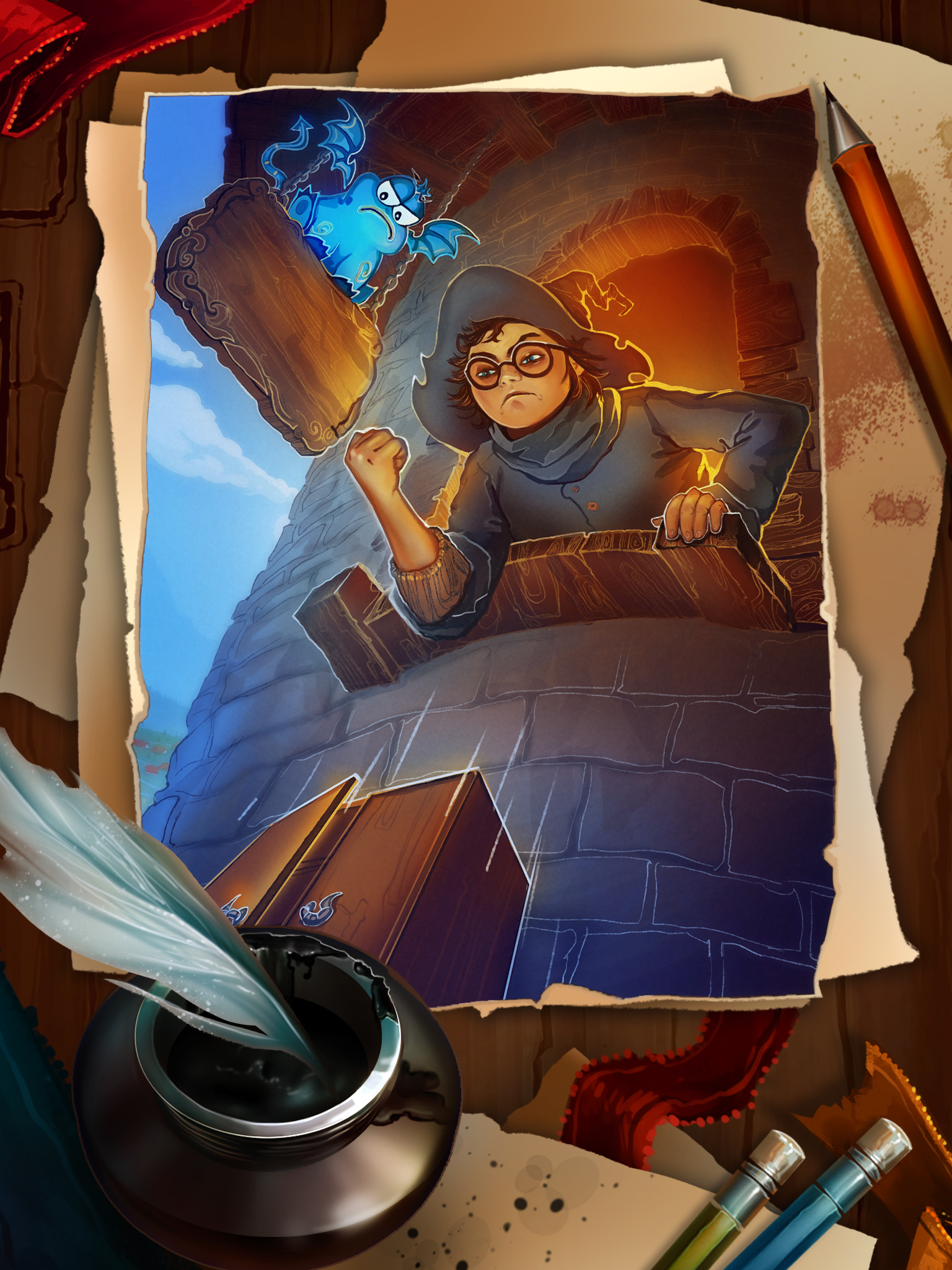
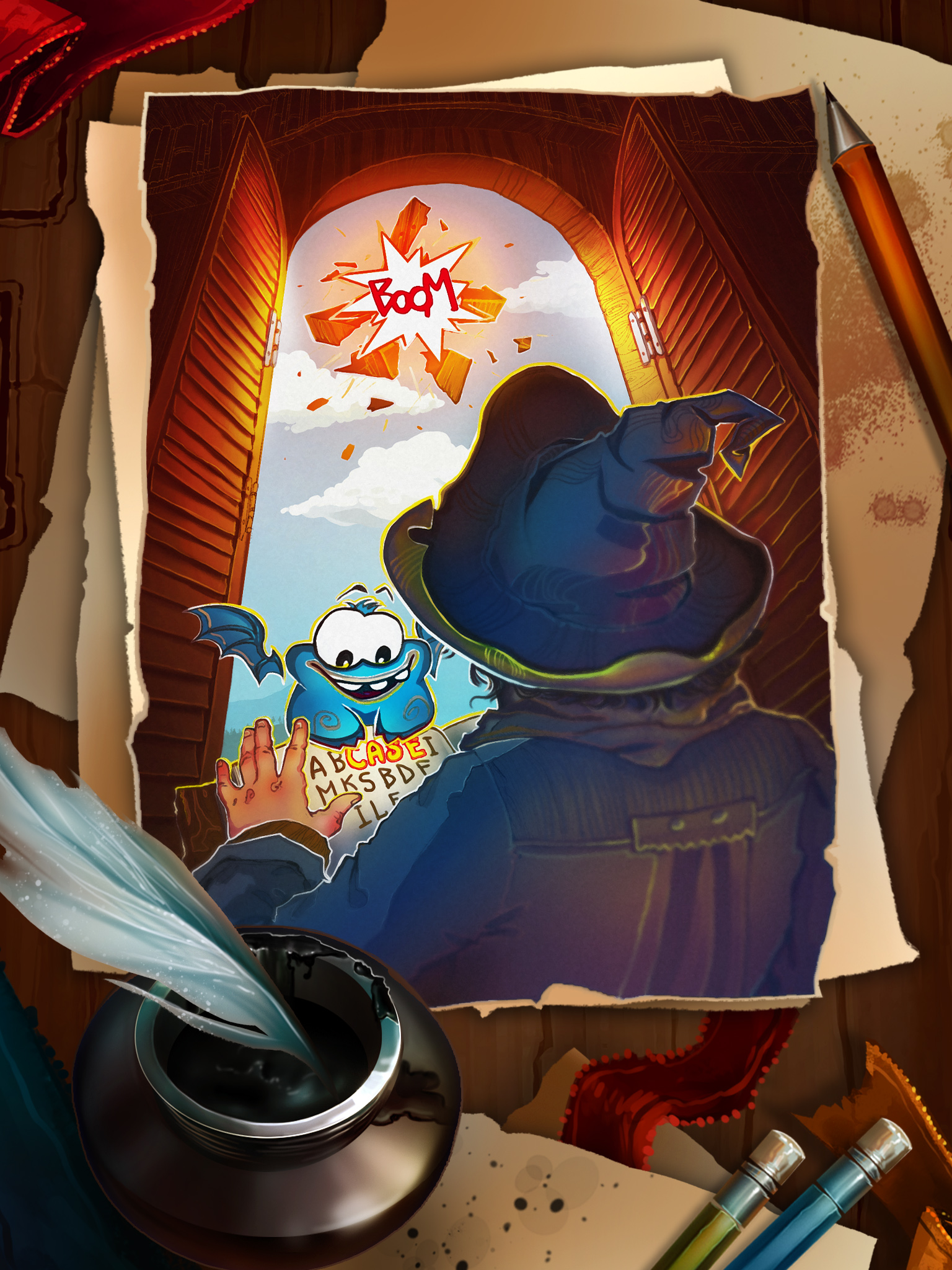
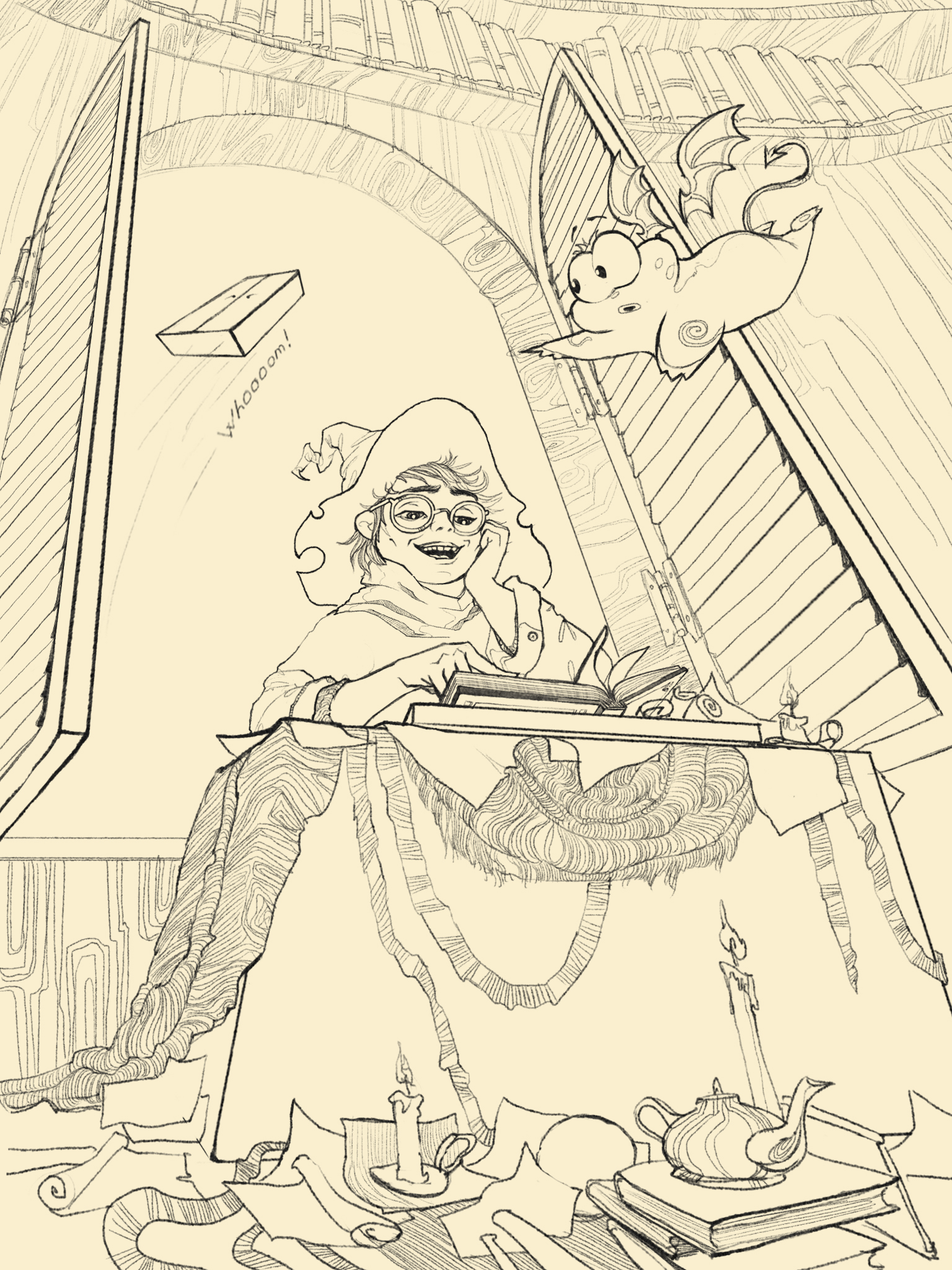
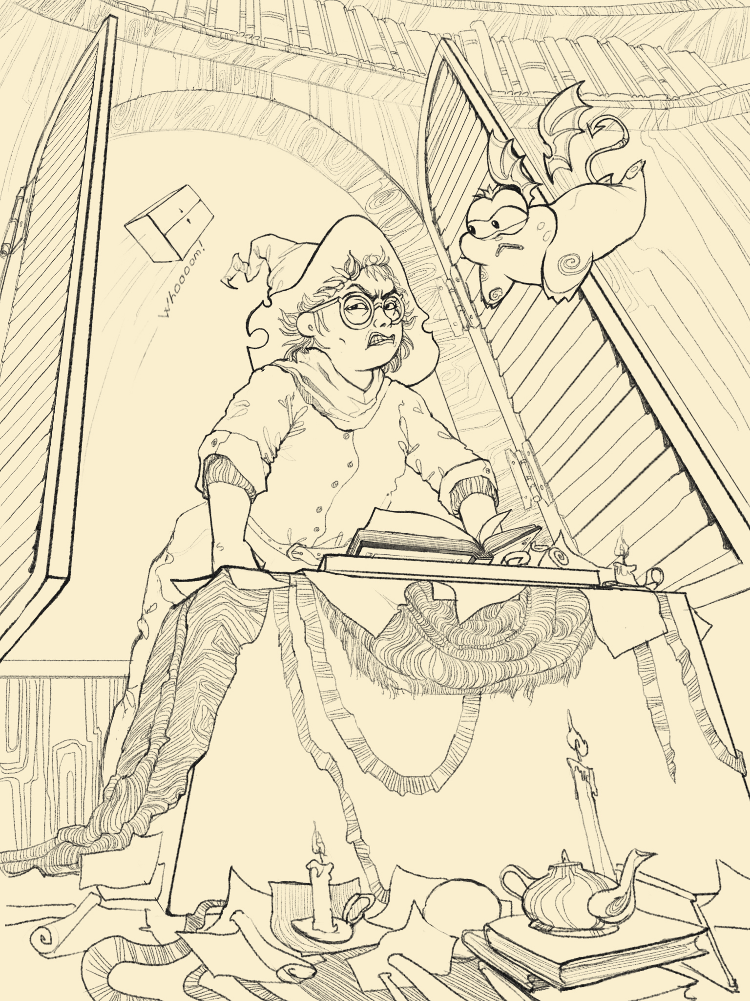
Game ”Burn the word”
| Commissioned by: | Role: | Technic: | Year: |
| Anonim | 2D artist | Adobe Photoshop | 2015 |
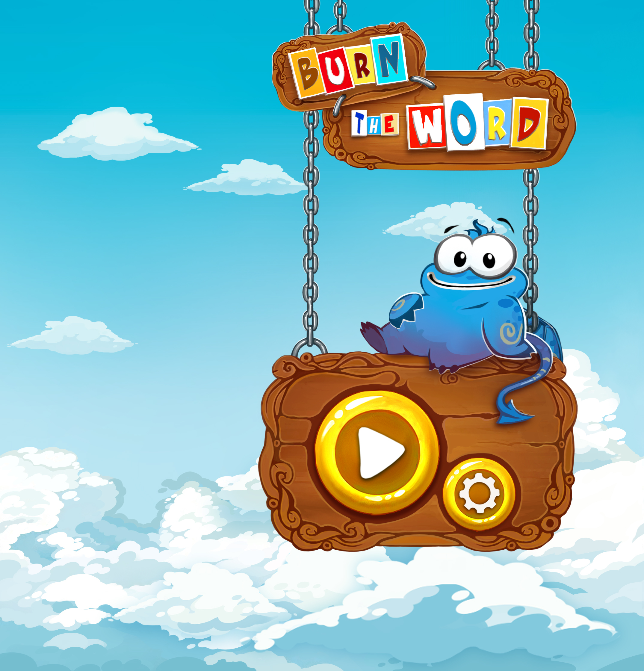
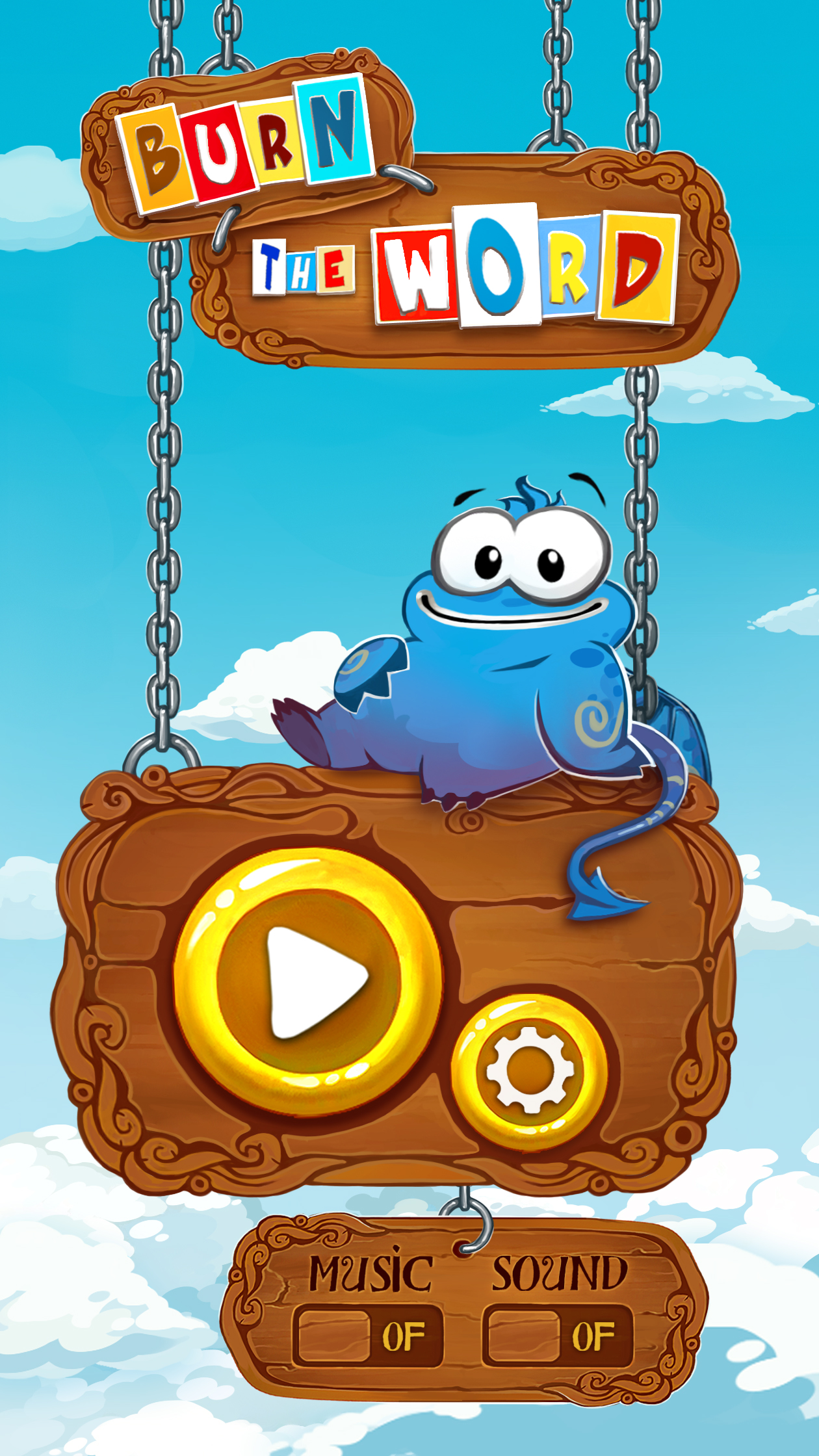
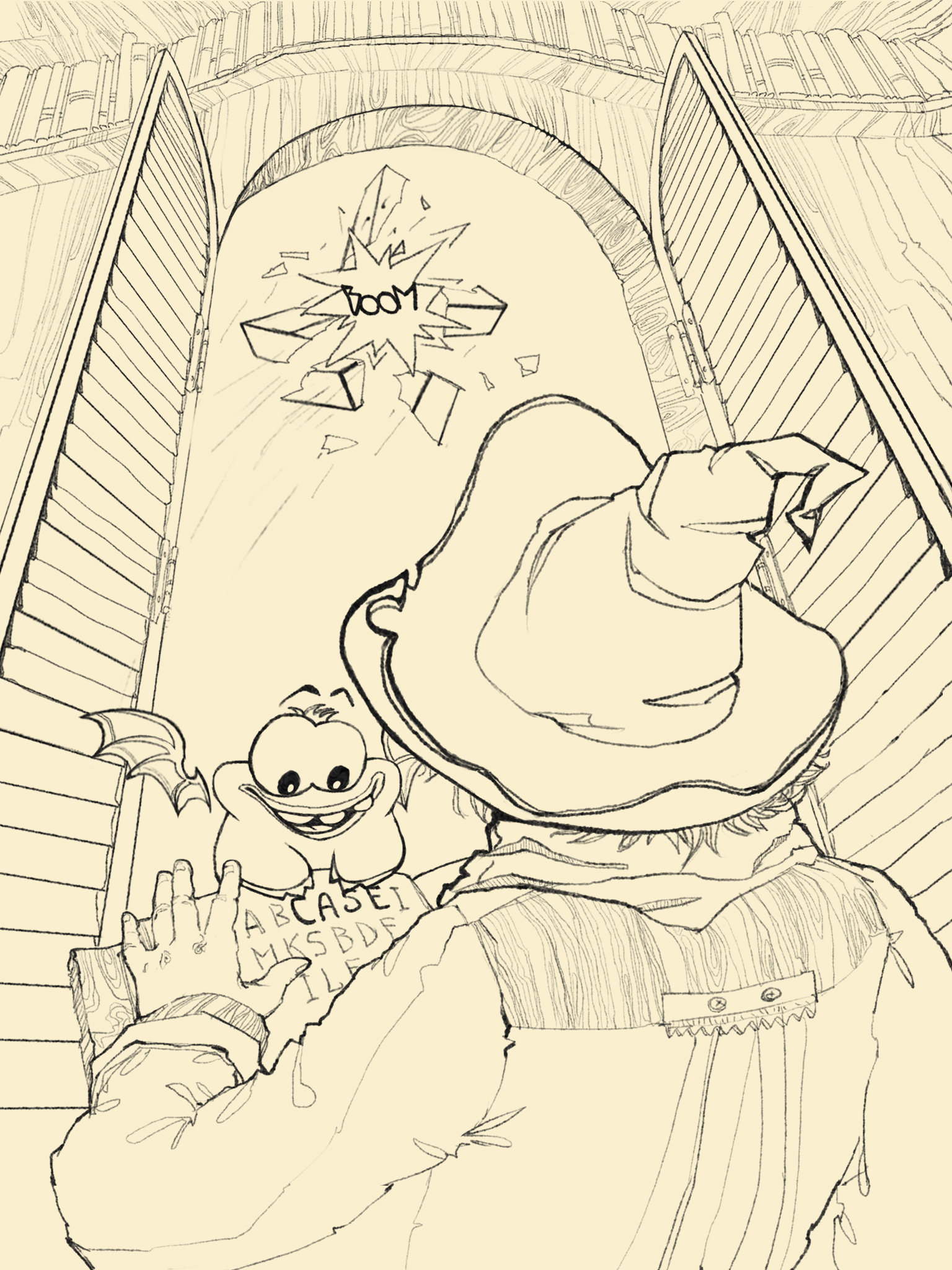
Burn the Word Game is a Puzzle Game for you. It is easy to play and challenging at the same time!
Try to find all hidden words in given letters, by connecting letters anyway you like to build the word! Have fun improving your vocabulary and spelling skills! You‘ll never be boried after you try this most addicting word puzzle game! Your brain will be thankfull for that workout!
![]()
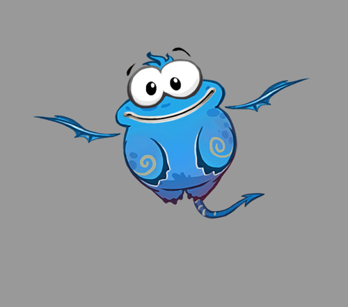
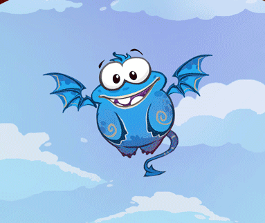
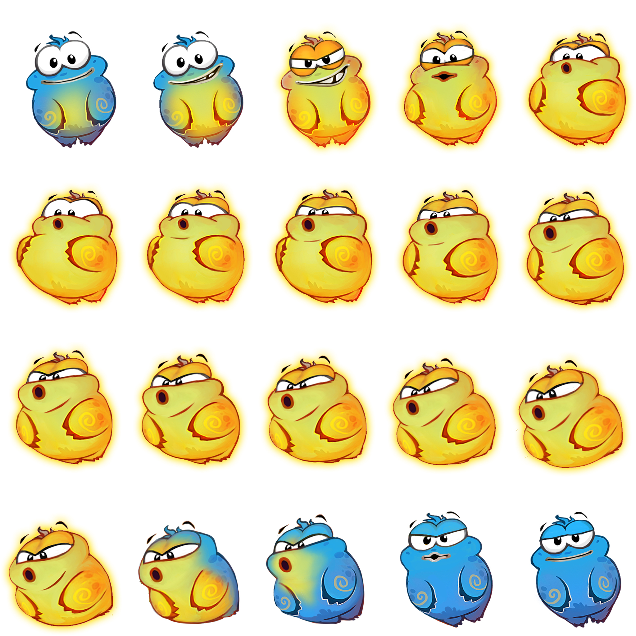
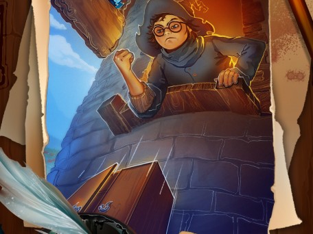
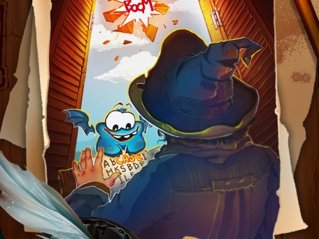
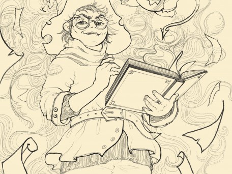
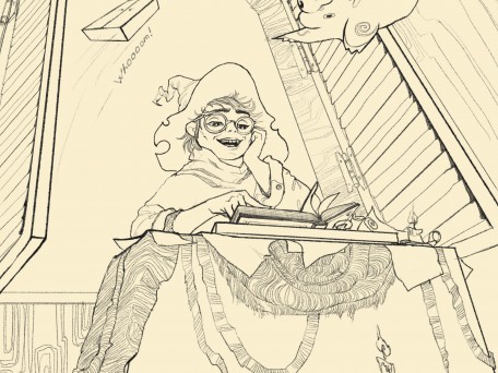
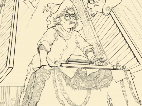
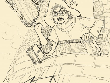
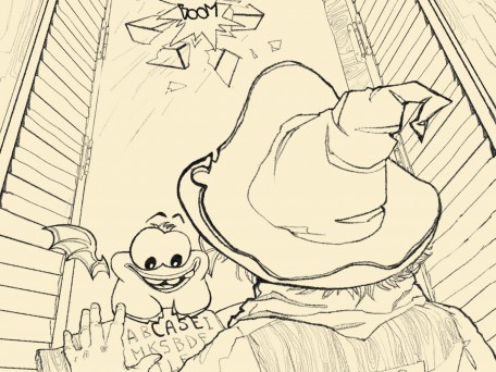
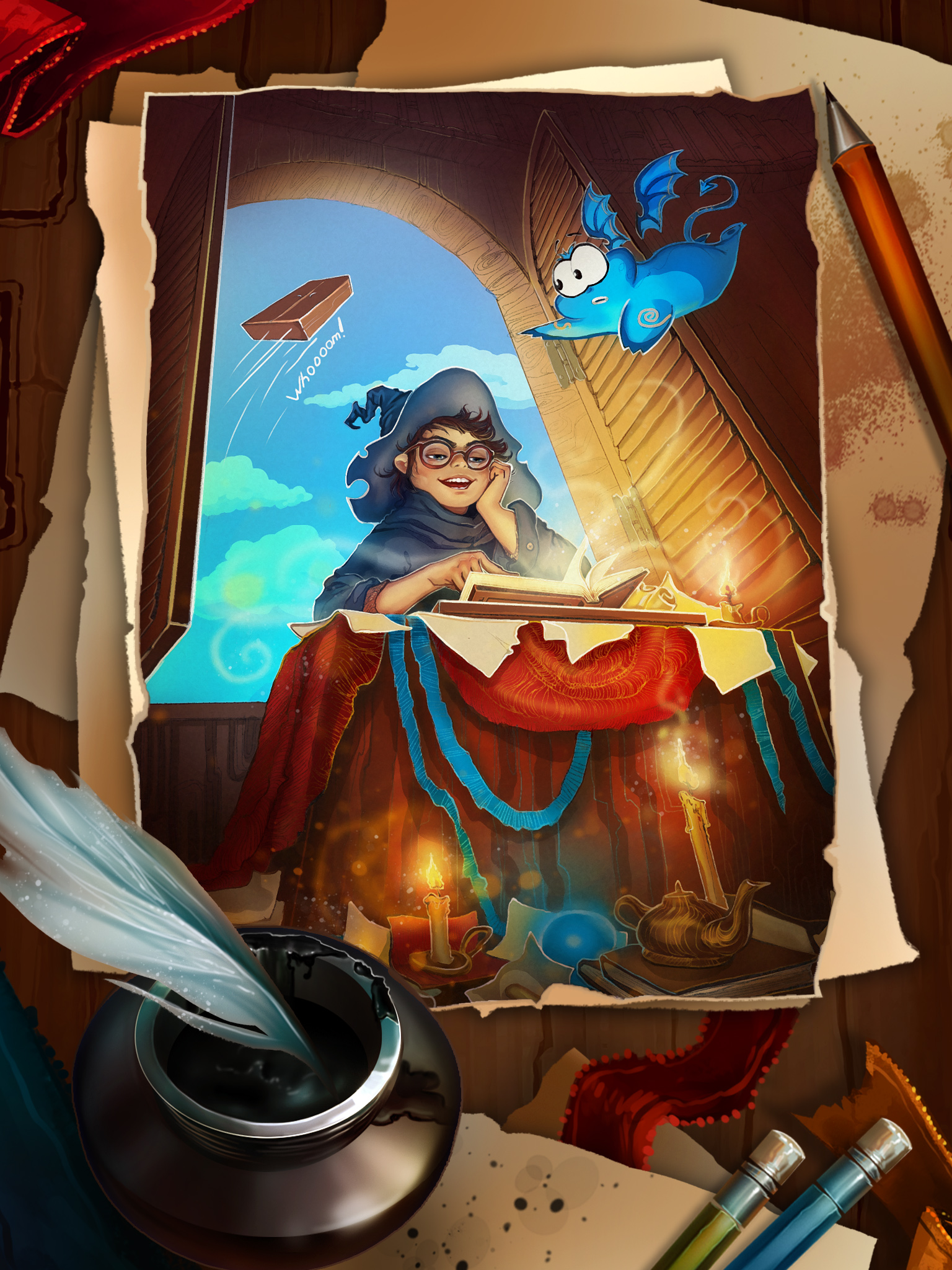
Cutscene
-
Cutscene table 2015d
-
Cutscene table 2015
-
Cutscene table 2015b
-
Cutscene table 2015a
-
Cutscene table 2015c
-
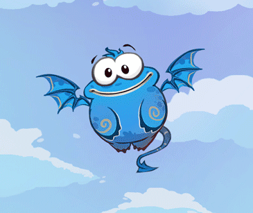
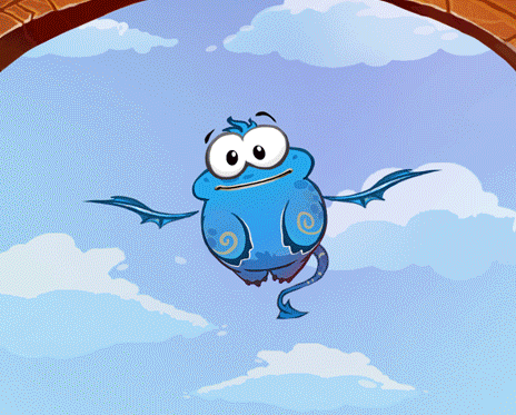
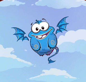
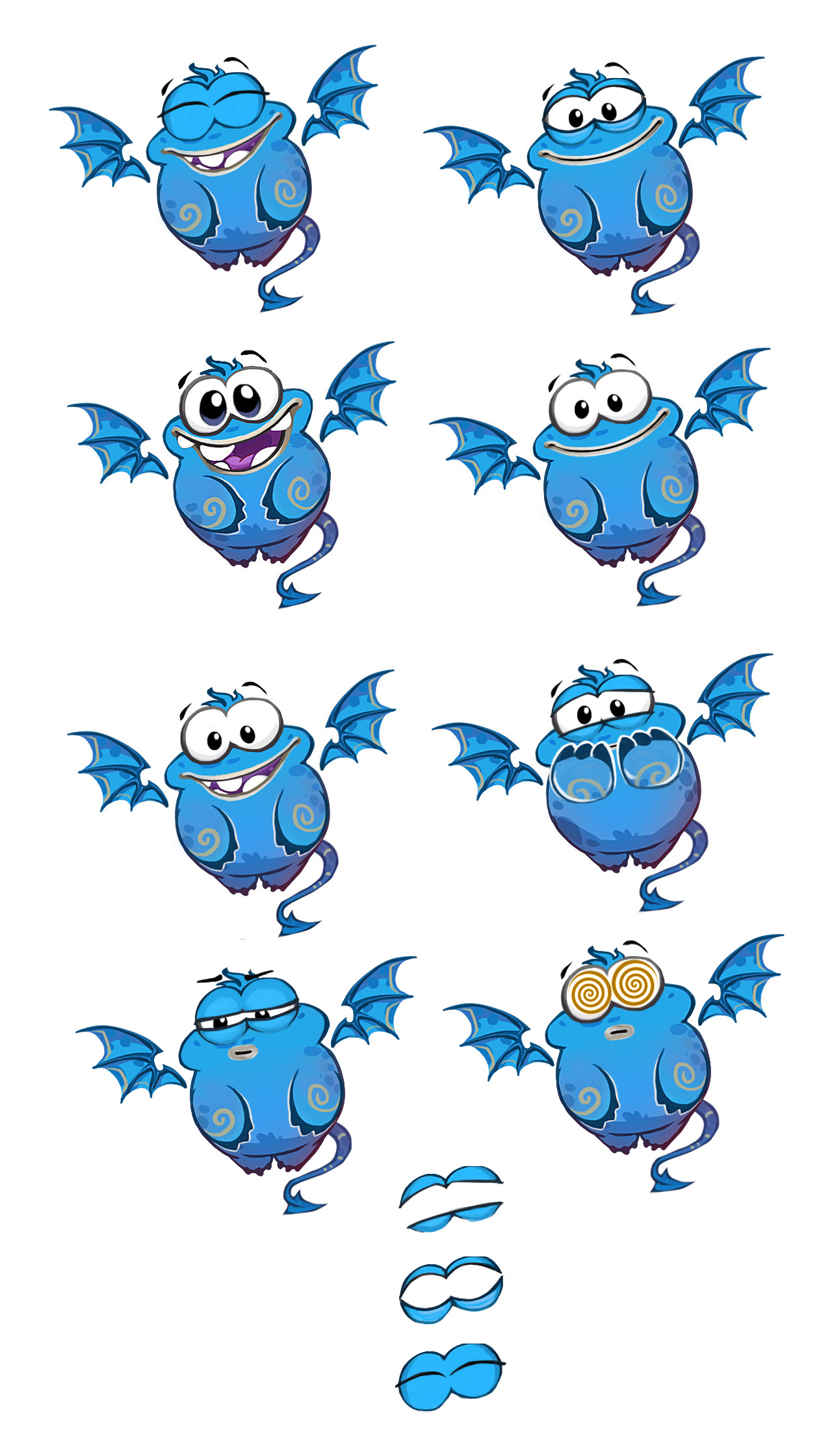
Cutscene5a
-
Cutscene1a
-
Cutscene3
-
Cutscene2a
-
Cutscene4


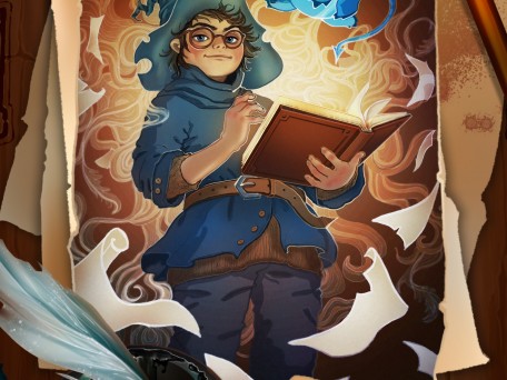
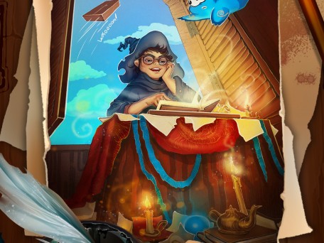
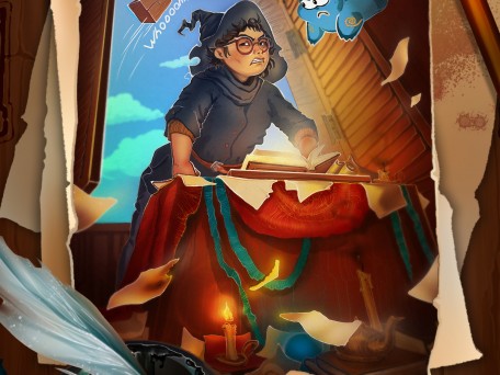
Concepts / Illustrations / Game UI
-
Sky. Fond
-
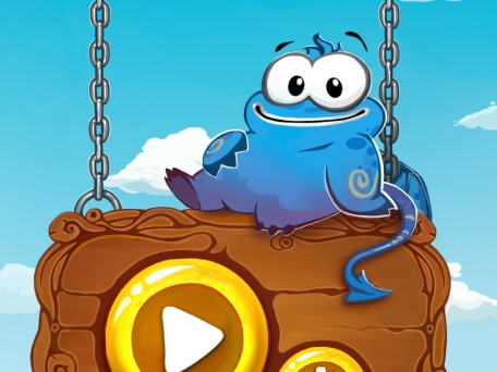
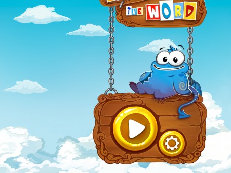
Option Menu
-
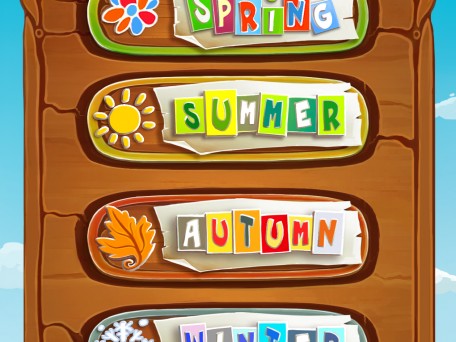
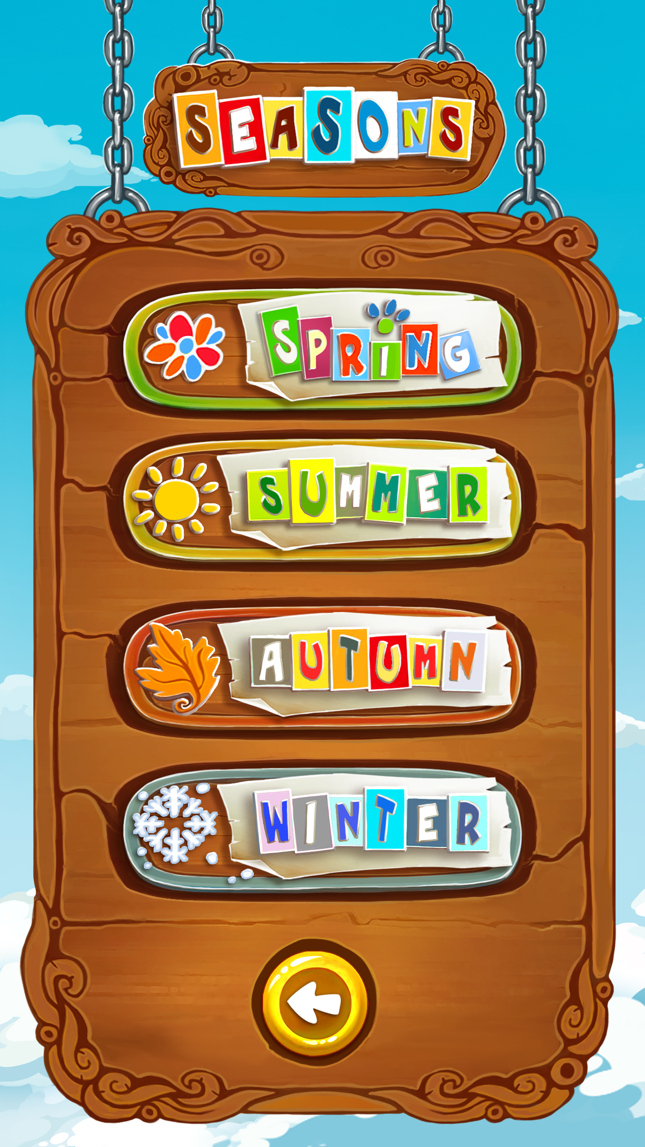
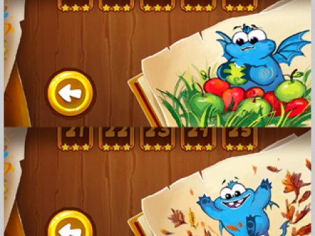
Menu seasons
-
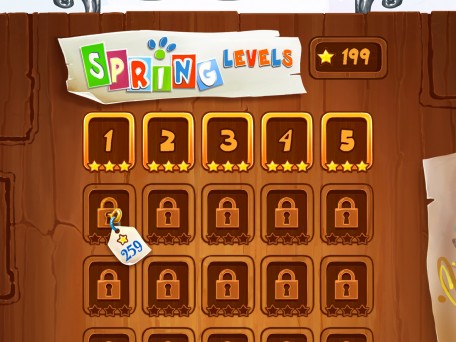
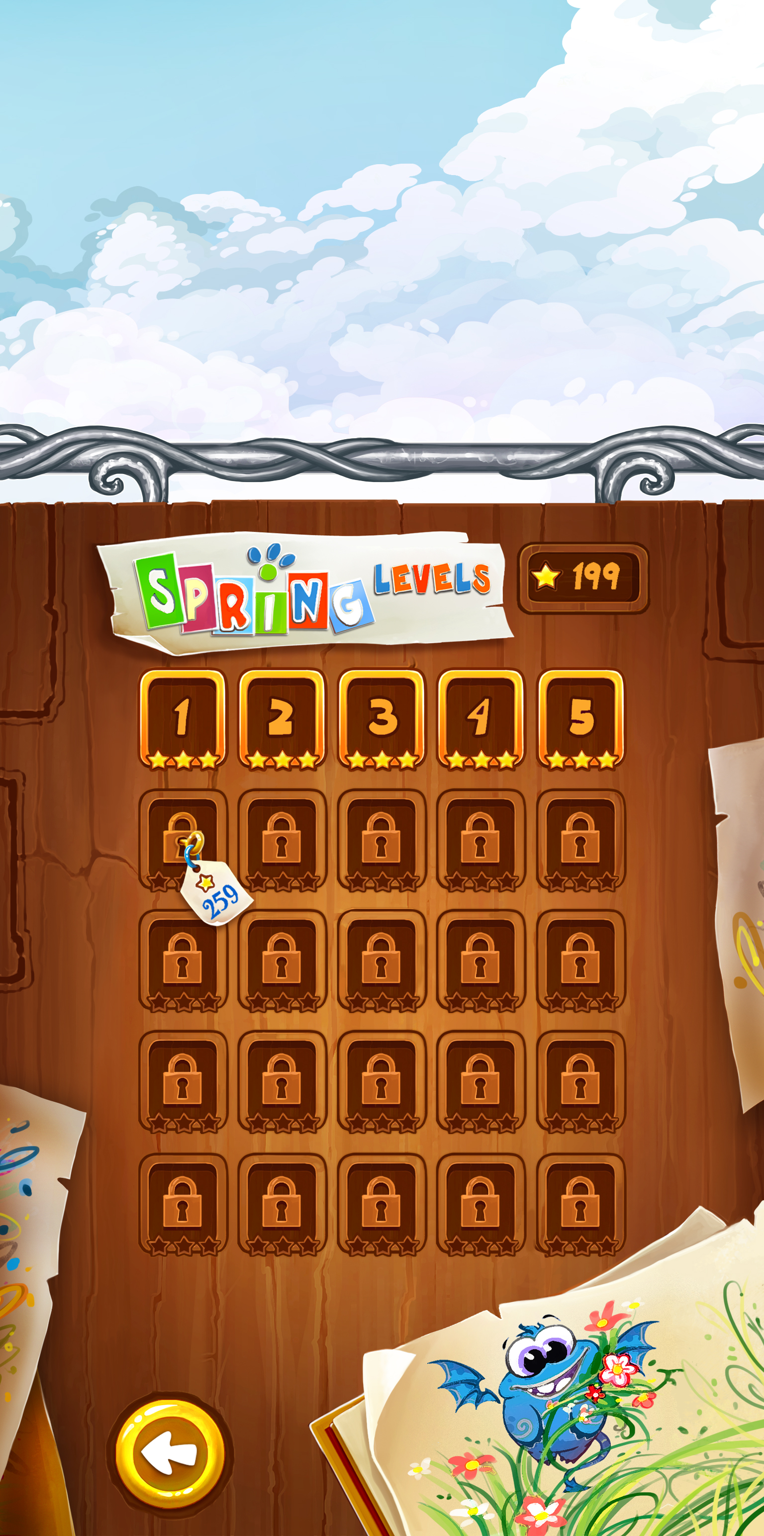
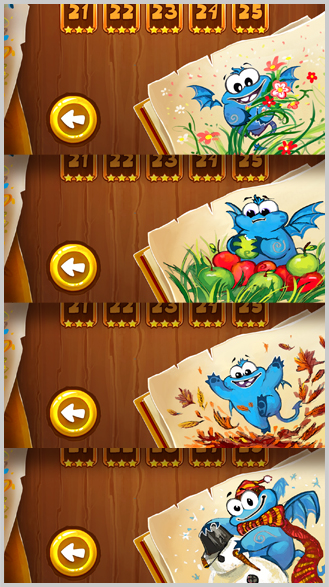
Spring levels
-
Illustration
-
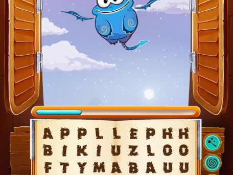
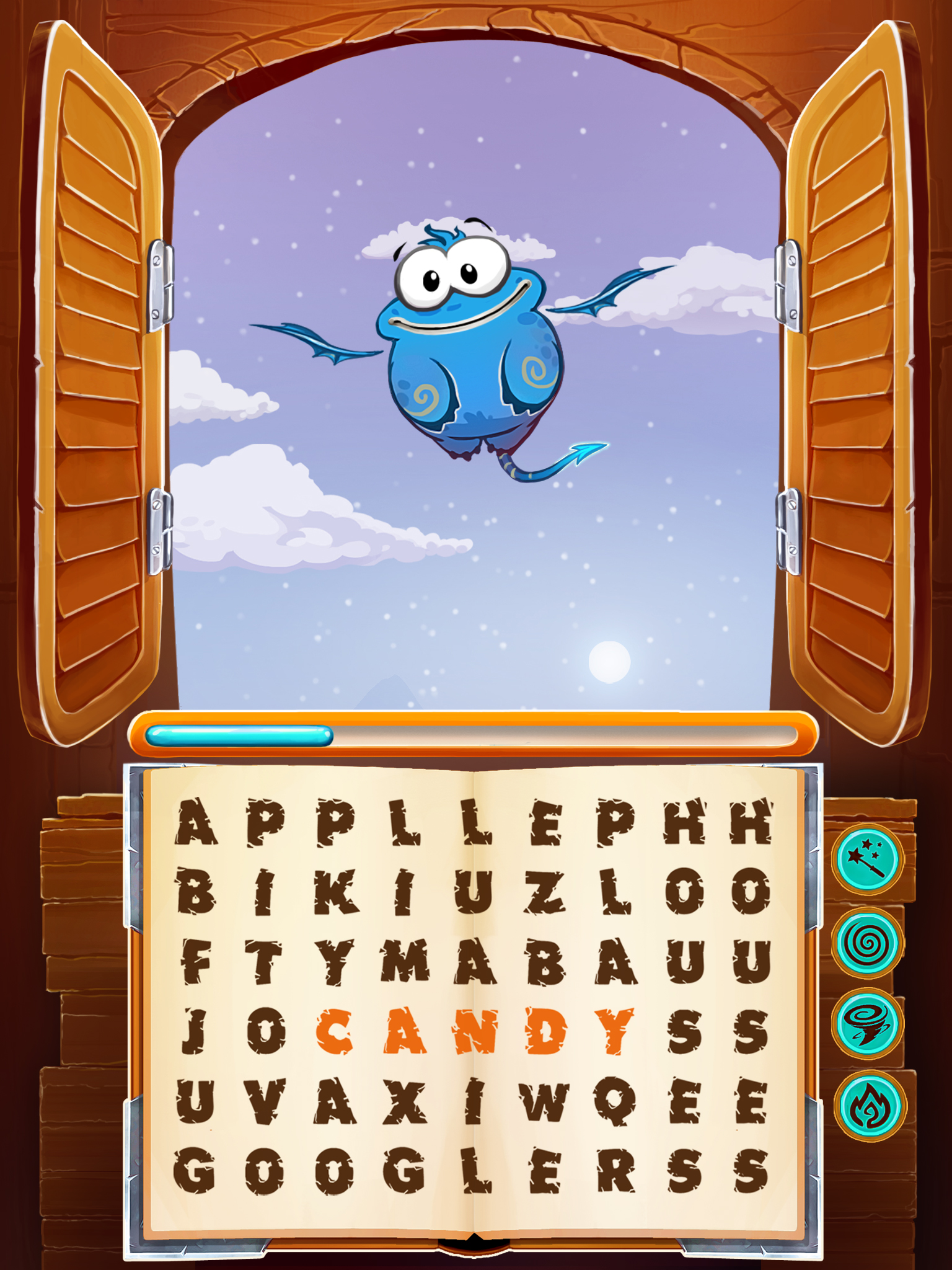
Gameplay
-
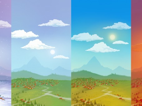
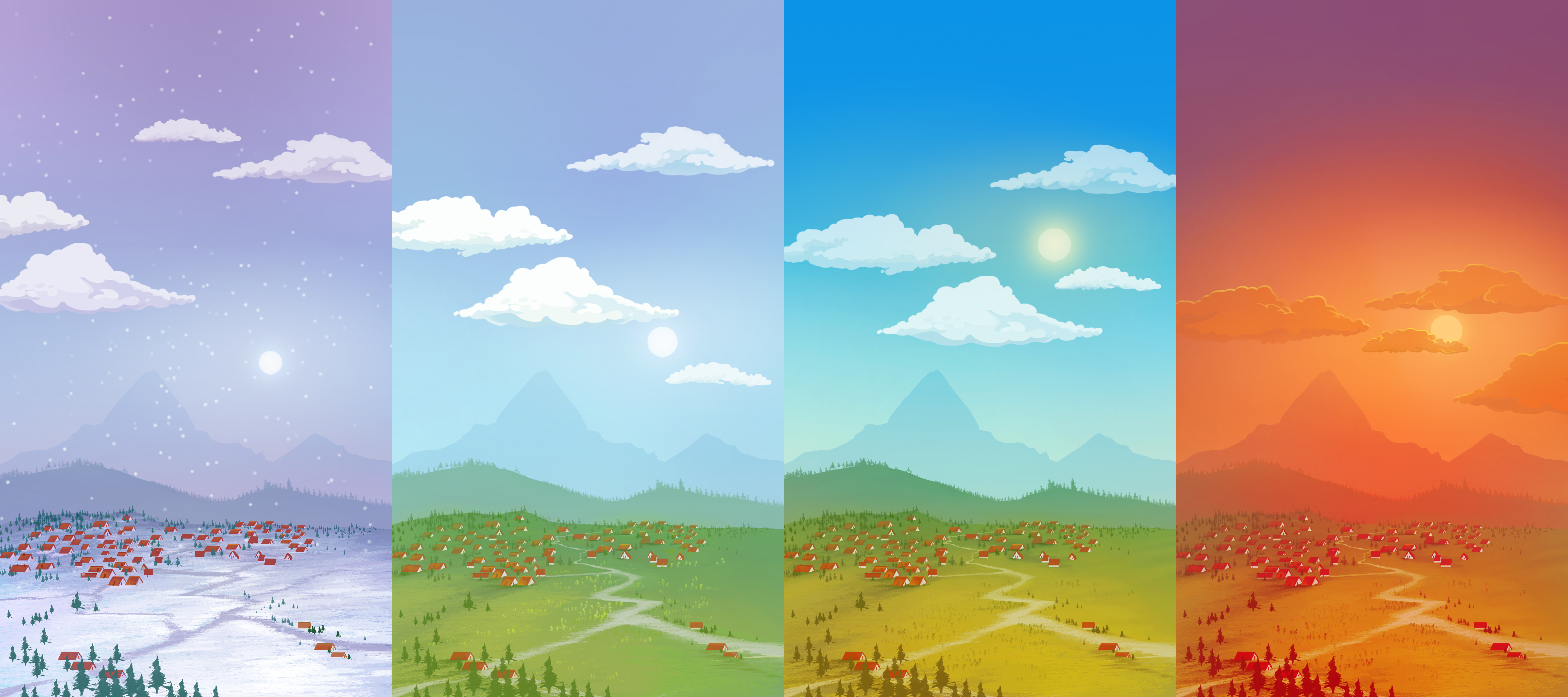
Background seasons all
-
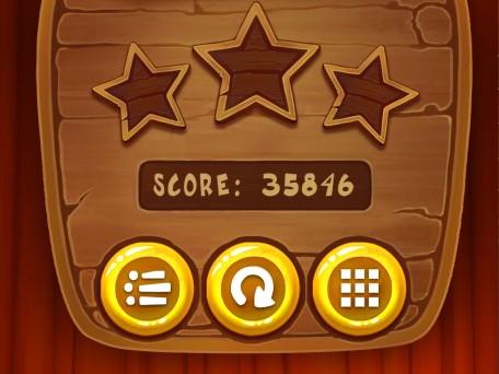
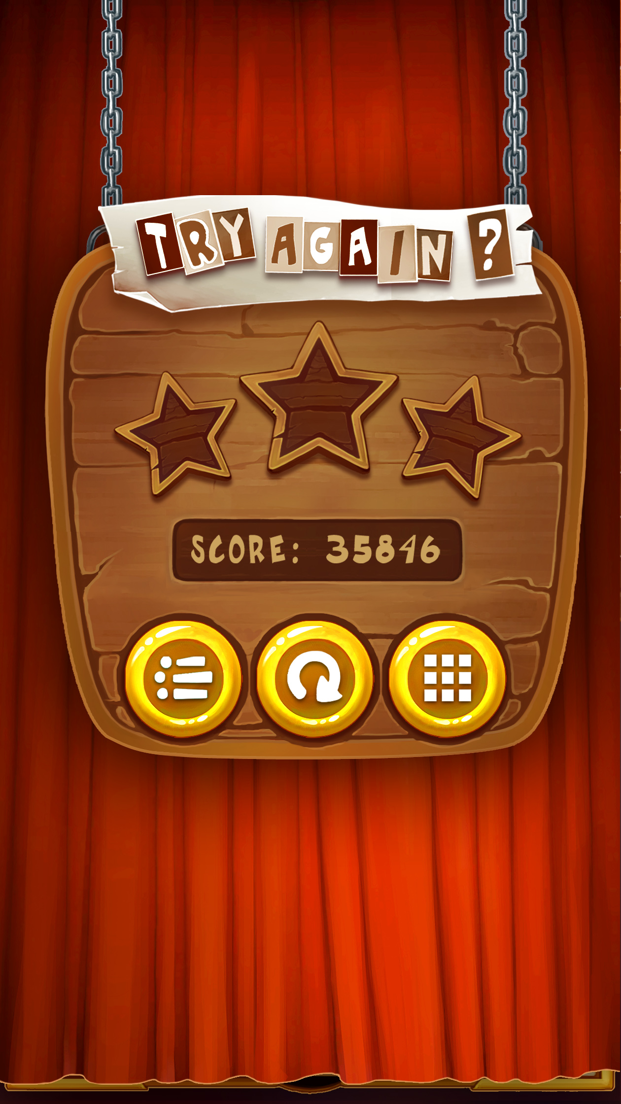
Menu try again
-
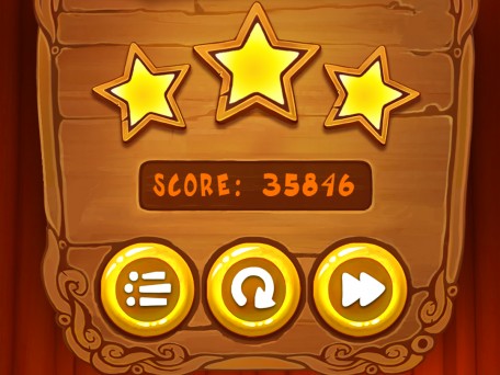
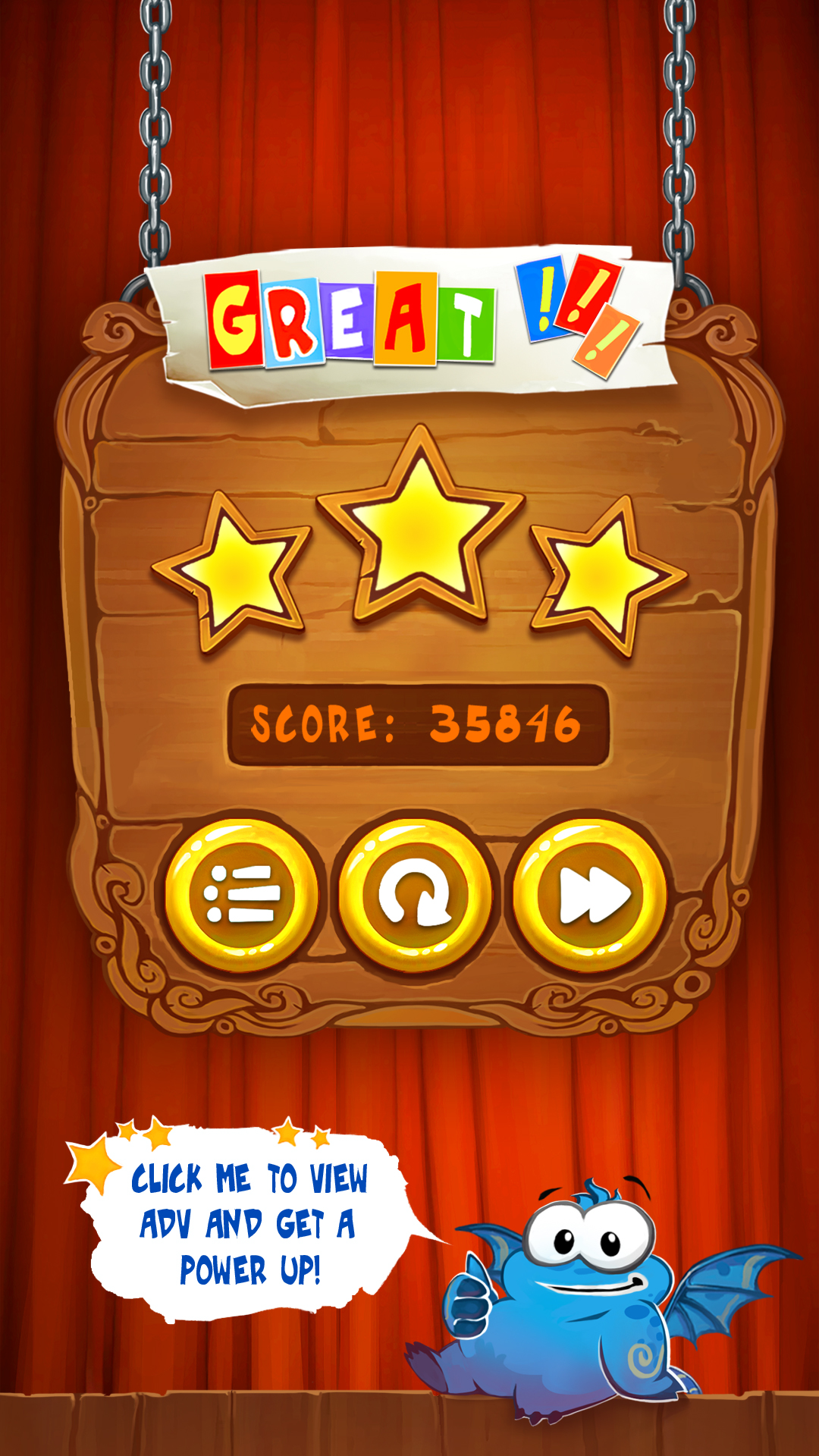
Menu: great(1080x1920)
-
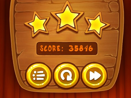
Menu: great
-
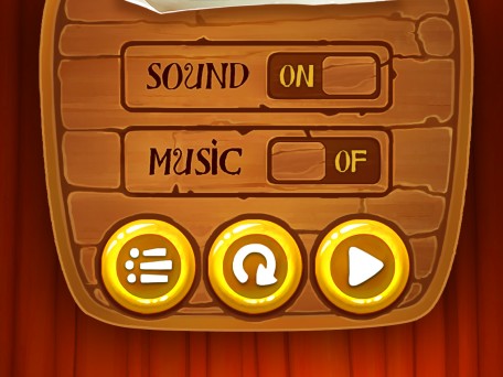
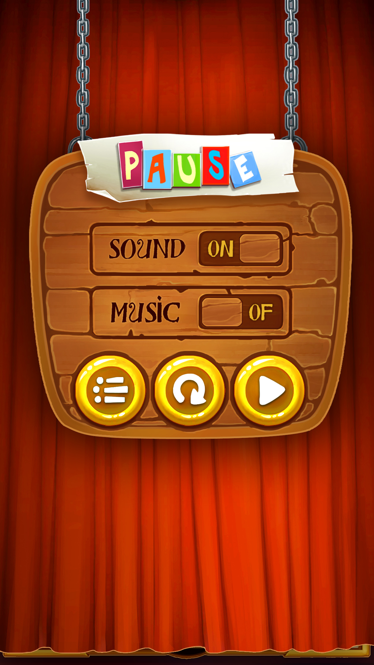
Menu: Pause
-
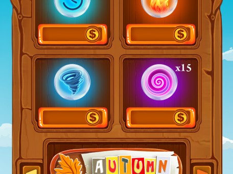
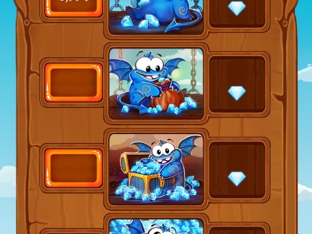
Menu shop
-
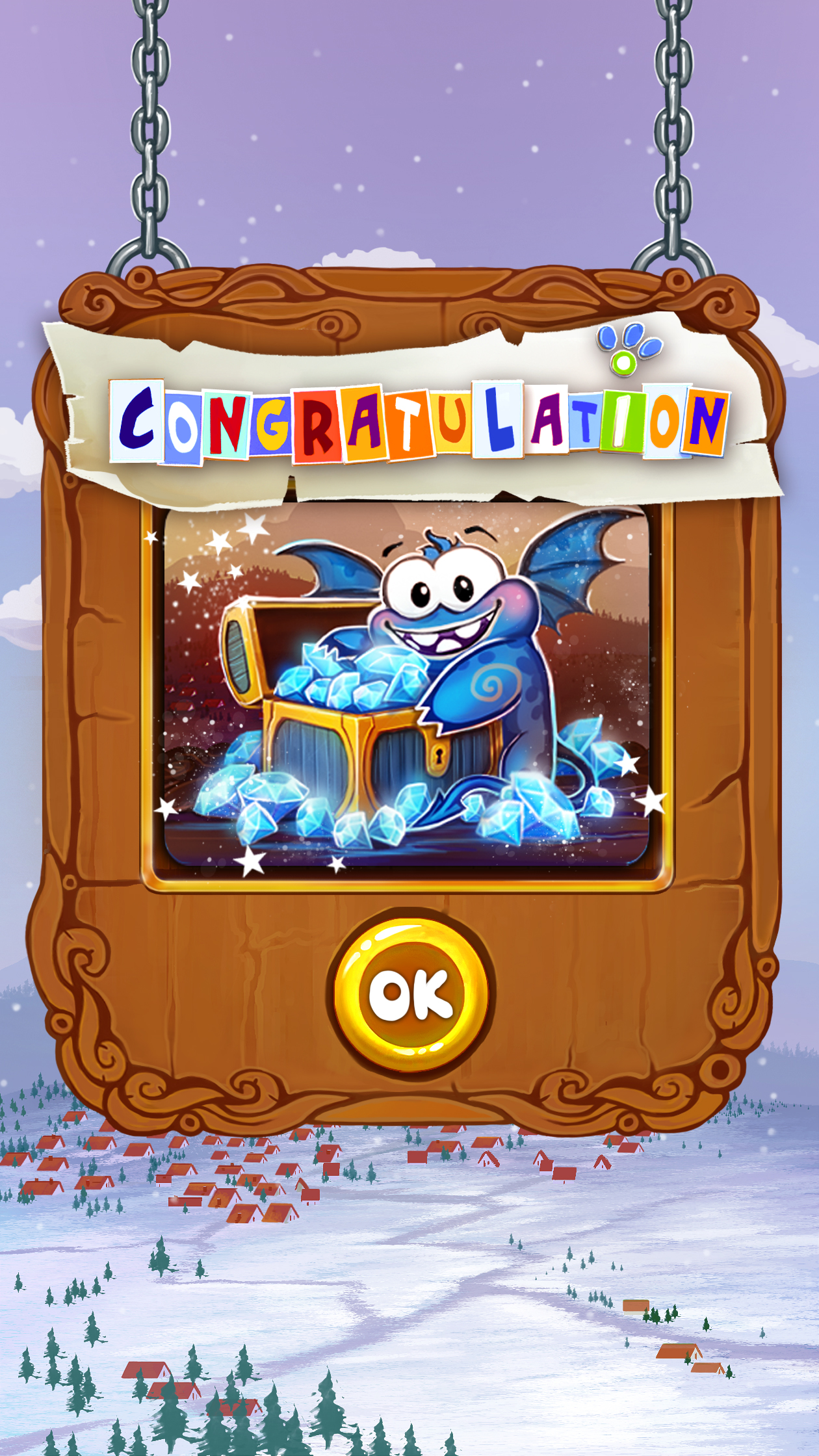
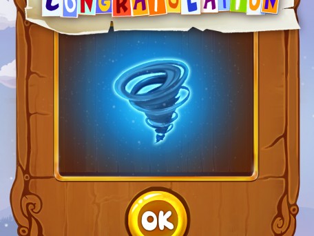
Menu shop: congratulation3
-
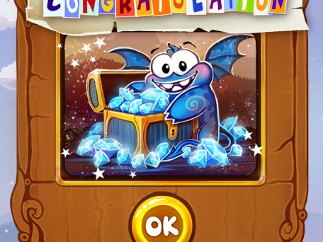
Menu shop: congratulation2
-
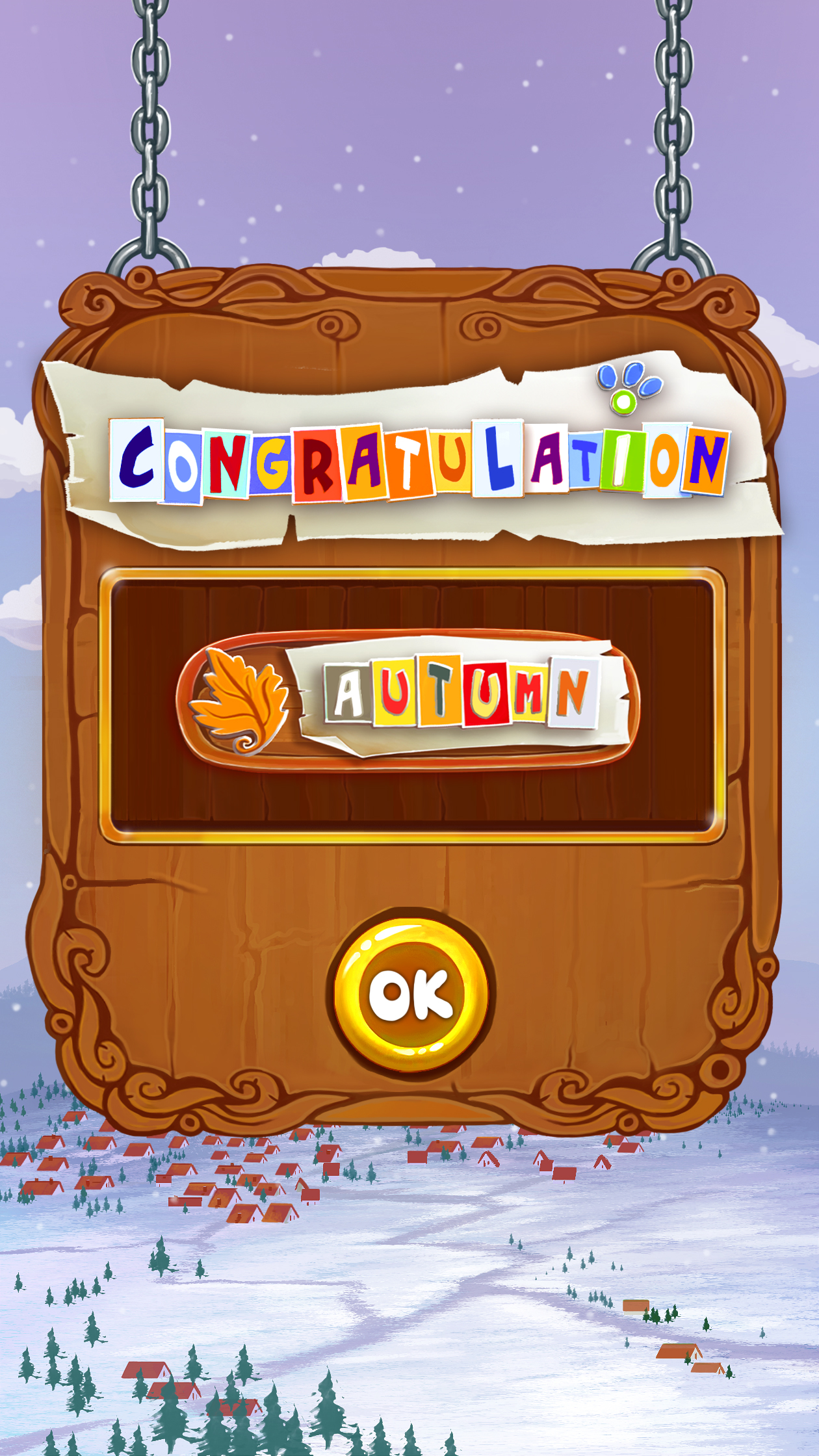
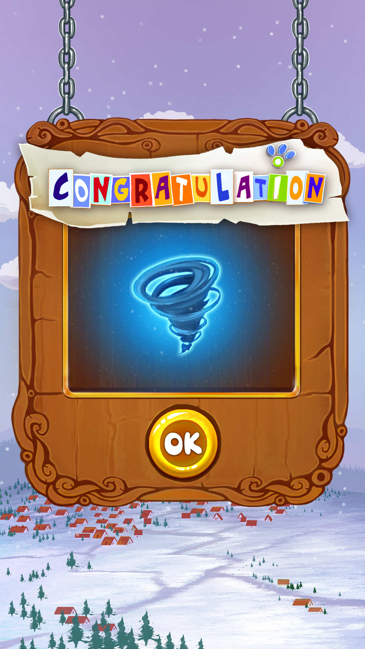
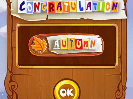
Menu shop: congratulation
-
Menu: shop (part 2)
-
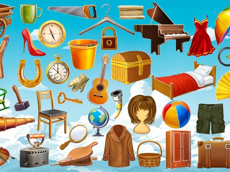
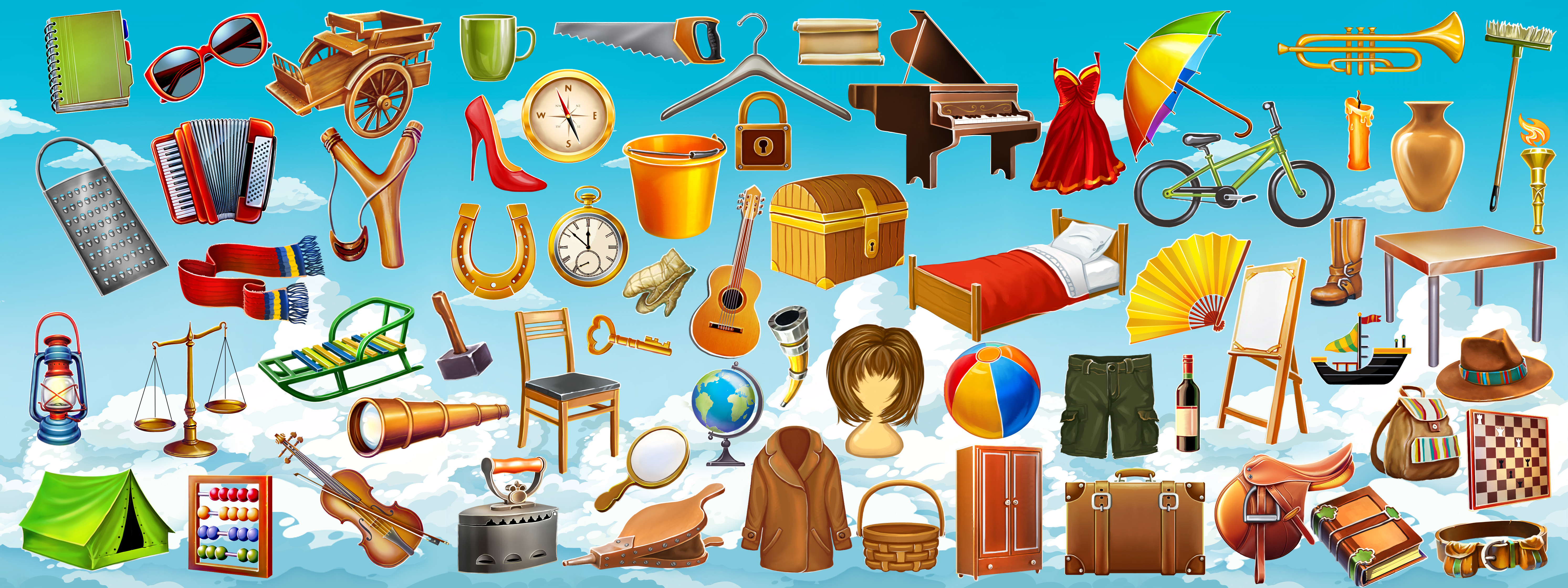
Items
-

Curtains